 The Whitney has not only the most paintings by Hopper, but also one of the largest collections of information about him in their library. I had naively thought that I might be able to look through Jo's journals and decide for myself what portrait they painted of Edward. But they had been sold to a private person, which I would not find out until the very last city I visited. I did discover that every museum has a file related to each work and each artist in their collection. These files became the source of much of what I learned about Hopper and his paintings. I was starting to become as curious about who Hopper was as I was about who the American people were. I was surprised that much of what I found had been overlooked by art historians and critics.
I found in one museum's file a "new" Hopper (OK, technically, a note written in his distinctive handwriting). I found personal letters from Jo and Edward, or even just from museum-goers, that offered back story on Hopper's paintings. One museum's file contained a curator's chart clearly showing how Hopper's perspective lines (those "train tracks"  leading to a single point where all items in a painting vanish) converged at different places, disorienting the viewer slightly and visually isolating each subject in his paintings. Julia was right: he got things "wrong" to get them the way he wanted.
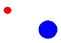
I had learned from my painter friend Bruce how an artist sees and thinks.  Whereas viewers may see scenes of isolation, an artist sees compositions, colors, lines. They are concerned with the realities and restrictions of putting gooey pigment onto a flat canvas and trying to represent an image of meaning to others. Painters divide a flat, two-dimensional surface into a tic-tac-toe board. Putting important elements where the lines intersect leads to a balanced combination. Bright colors take more of your attention than dark. Think of having to balance a see-saw with a small red ball of heavy lead on one side and a big blue balloon on the other.
  Shapes also demand balance. For example, a downward triangle at the top of the canvas would be balanced by an upward one at the bottom.
Color is ultimately what makes all of these trompe l'oeil effects trick you into seeing three dimensions on two. Color theory is a deep subject worth looking into if you admire art, but basic concepts include complementary colors and cool and hot colors. On a color wheel , the primary colors are red, blue and yellow. Their complementary colors are directly across from them, a combination of the other two primary colors. Hot colors often contain red, while cool ones contain blue.
Having visited the two cities (DC and New York) that combined held nearly half of the Hoppers I needed to see, I began to notice more Hopper's artistry and less his isolated scenes and characters. Many consider his compositions some of the finest in 20th-century art. Hopper divided the canvas into thirds and put important elements of the composition at the lines dividing the canvas into thirds, either vertically or horizontally
 . Hopper also connects these thirds by having one element span all three, like this lighthouse.
  Hopper's paintings are textbook examples of simple, well-balanced compositions. Turn his paintings upside down; they still look balanced.
Hopper often put part of an object in the foreground (at the very bottom). This gives you a visual element, an anchor, from which you can read the "depth" of the rest of the objects in the painting. It also adds to the feeling that you are in the painting and in its drama. You might be standing on these stairs at bottom left. 
Hopper often inserts "ladders," a series of horizontal lines that lead vertically. In  Room in New York, that seems to add to the feeling that the characters want to crawl out of their situation; they could use either the door or the window. A museum worker also noted that these ladders look like film cells. The windows in other paintings not only look like they are framed by film sprockets, but also seem to be viewed in the fashion of one convention for movie beginnings in the 1920s, where the camera floats to a window and then (magically, it would appear to an audience of that day) enters the room.
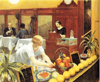
Some of his paintings have visual puns or implications: a radiator, fire, and bed in a room with a woman in her slip in  Night Windows; a row of round fruits by a buxom waitress leaning forward in
  Tables for Ladies ; a banana and a bowl of red fruit behind a lone woman in
  Automat. A piece of paper on the floor in
  Office at Night begs the question whether the woman in the tight skirt will bend over to pick it up. Someone said that the Christmas (EX-MAS) lights in
  Drug Store (EX-LAX) look like enema bags and that the pennants in the window represent port and starboard flags on a ship.
Some forms in his paintings look like other things: the foliage in Hills, South Truro mimics the shape of a dog with a tail up and mouth open ; a hill in Camel's Hump resembles an alligator's head
 .
.
His titles often included puns, too; Two on the Aisle was painted right after he got a married and could be read as "Two on the Isle" (a record I found in the museum's files actually spelled it that way). Morning in a City could be "Mourning in a City" as the woman is alone, and the painting was done during World War II. Thus, Morning Sun might be read "Mourning Son."
And then there are those "mistakes" Julia pointed out. Columns lead nowhere and office walls end before the ceiling  ; doors are unnaturally high
  ; beds are too small to sleep in
  ; shadows fall longer than possible
  .
.
The glass in is paintings never has reflections.  This is how we think of glass, but not how we actually see it. Windows paradoxically provide a physical barrier but a visual opening. Similarly, we look past the clutter of streetscapes, though they usually have people, cars, trash, and even kiosks. Hopper's scenes don't.
His characters' faces are indistinct.  They are not meant to invite narrative or musing about their lives. But this backfired, as their very anonymity or isolation is what makes people yearn to know their thoughts and feelings.
20081108
55 Hopper's Techniques
Subscribe to:
Post Comments (Atom)


No comments:
Post a Comment